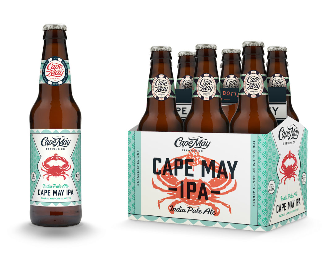
Cape May Brewing Company has a brand new look! As of May 26th, Cape May Brewing Company has made a giant change to a new logo and branding that was announced in a press release last week. The website has been updated to a fresh, new look inspired by the beach community that it resides.
![]()
Cape May Brewery is already one of the premier craft beer breweries in the region with a loyal following, so why do this now?
“This all really began as a desire to update our website,” says co-founder and president of CMBC, Ryan Krill. “However, we quickly realized that a simple website redesign wasn’t going to be enough. In order to put together a website that exemplified who we are and where we are going as a company, we first needed to take a step back and truly define ourselves.”
Through this process, the company was able to put into writing a set of Core Values, a Mission Statement, and a Statement of Purpose: “To build a brewery that makes us proud.”
“We’ve come a long way over the past six years,” says co-founder and COO Chris Henke, “and our new look reflects that growth. The three of us — Ryan, his dad, Bob, and I — started by brewing twelve gallons at a time. This year, we’re poised to break the 10,000 barrel mark. We currently brew as much beer in one week as we did in our entire first year of business.
“We’ve grown up. Our new look needed to reflect that.”
The new look is based on what Cape May represents as a beach community.
“We really wanted to find something that says Cape May,” Henke says. “This community has come to embrace us over the past six years, and we realized that Cape May’s laid back beach culture has been a huge influence on our organization. We wanted to reflect that.”
![]()
The new design expresses a windswept feeling — like a breezy day on the beach, umbrellas flapping and seagulls flying overhead.
“You just feel cooler,” Krill says, “our new look evokes a refreshing, relaxed feeling — like a cold beer on a hot day.”
The new designs provide CMBC with a cohesive look across multiple platforms, including their revamped website and new bottle designs. Consumers will be able to instantly recognize Cape May Brewing Company’s packages in the retail environment through this new, unified design.
“For the past six years, each of our bottles had a radically different look,” says co-founder and vice president, Bob Krill. “Aside from our logo, the designs don’t otherwise communicate CMBC. They were all one-off designs with no real connection to one another or to CMBC.
While CMBC’s look has changed, the three owners think it’s important to understand that the only thing that has changed is the look. The product won’t change in any way.
“The quality that our fans have come to know and love from CMBC will not be compromised,” Ryan Krill says. “Our fans put an extraordinary amount of trust in us, and that’s something we take very seriously.”
“We’ve always stood behind our quality,” Bob Krill says, “and we wanted the quality of our beer to be reflected in our creative design. We feel this design communicates exactly that.”
“The new design creates an expectation,” says Henke, “and the beer inside exceeds that expectation. The beer speaks for itself, but we think that new fans will be able to judge us by our packaging.”
“Ultimately,” Ryan Krill says, “establishing a cohesive brand will allow our leadership in the industry to flourish. As we continue to grow in coming years, the new look will assist us as we emerge as leaders within the industry, yet continues to recognize the enormous influence of the Cape May community upon our company.”
For more information on Cape May Brewing Company, including for tours and tastings, see capemaybrewery.com or call (609) 849-9933.